Blog categories

  • Emonio Firmware  (3)
    Emonio Firmware Here you can find all news about the Emonio firmware. Read which new features come with a new [...]
  • Emonio App  (9)
    Emonio App News regarding the Emonio App for Android and iOS. Read what new features are coming with a new [...]
  • Pro Emonio  (3)
    Pro Emonio News about our energy management software Pro Emonio.
  •  (1)
See all

New Extreme Values Dashboard

- Categories : Pro Emonio

The new "Extreme Values" dashboard provides a simplified and predefined view of minimum and maximum values, which makes it easier to evaluate them.

In order for data to be displayed in the new dashboard, the Emonio must also transmit the extreme values. This is the case if "XTRM" is checked in the telemetry settings.

Figure 1: Extreme value setting

The dashboard has been added to the "Standard" dashboard group and can be found in sixth place. Once opened, the maximum values are displayed.

At the top edge, there are six cards with numerical values (see Figure 2). The three columns represent the three phases. The top row shows the maximum power for the current week (Mon-Sun). The bottom row shows the value for the current month. The corresponding time intervals are fixed and independent of the time interval selected for the entire dashboard.

Figure 2: Overview of extreme values

Below are graphs showing the power, current and voltage over time. The legend also shows the extreme value for the time interval shown. An excerpt from the graphs can be seen in Figure 3.

Figure 3: Time sequence

The button at the top right of the screen can be used to switch between maximum and minimum values. The switch position and the labels on the cards/graphs indicate whether minimum or maximum values are being displayed. The button is marked in Figure 4.

Figure 4: Changeover switch
Deeper insight

What values are actually used here? And what is the difference between this and the other dashboards? Why have a dedicated dashboard?

To understand this better, we need to look at two technologies:

  1. What data the Emonio sends to the telemetry server
  2. What data is displayed in dashboards and how
Data transmission to the telemetry server

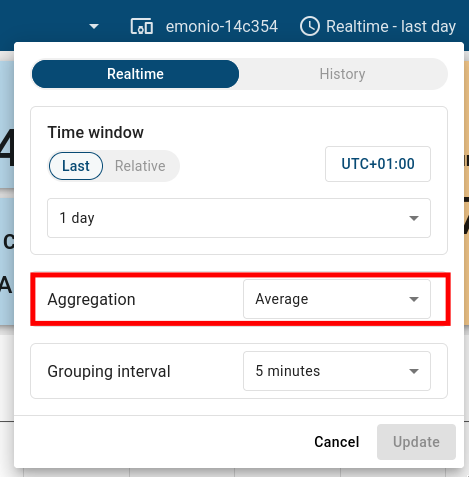
The Emonio transmits energy data to the telemetry server at the set send interval. The default interval is one second, but for the sake of clarity, we will assume a send interval of one minute in the following. The Emonio basically transmits two types of energy values:

  1. Quarter-hour values:
    Every 15 minutes, a summary of the last quarter hour is sent.
  2. Current values:
    These are sent at the set interval (in this case, every minute).

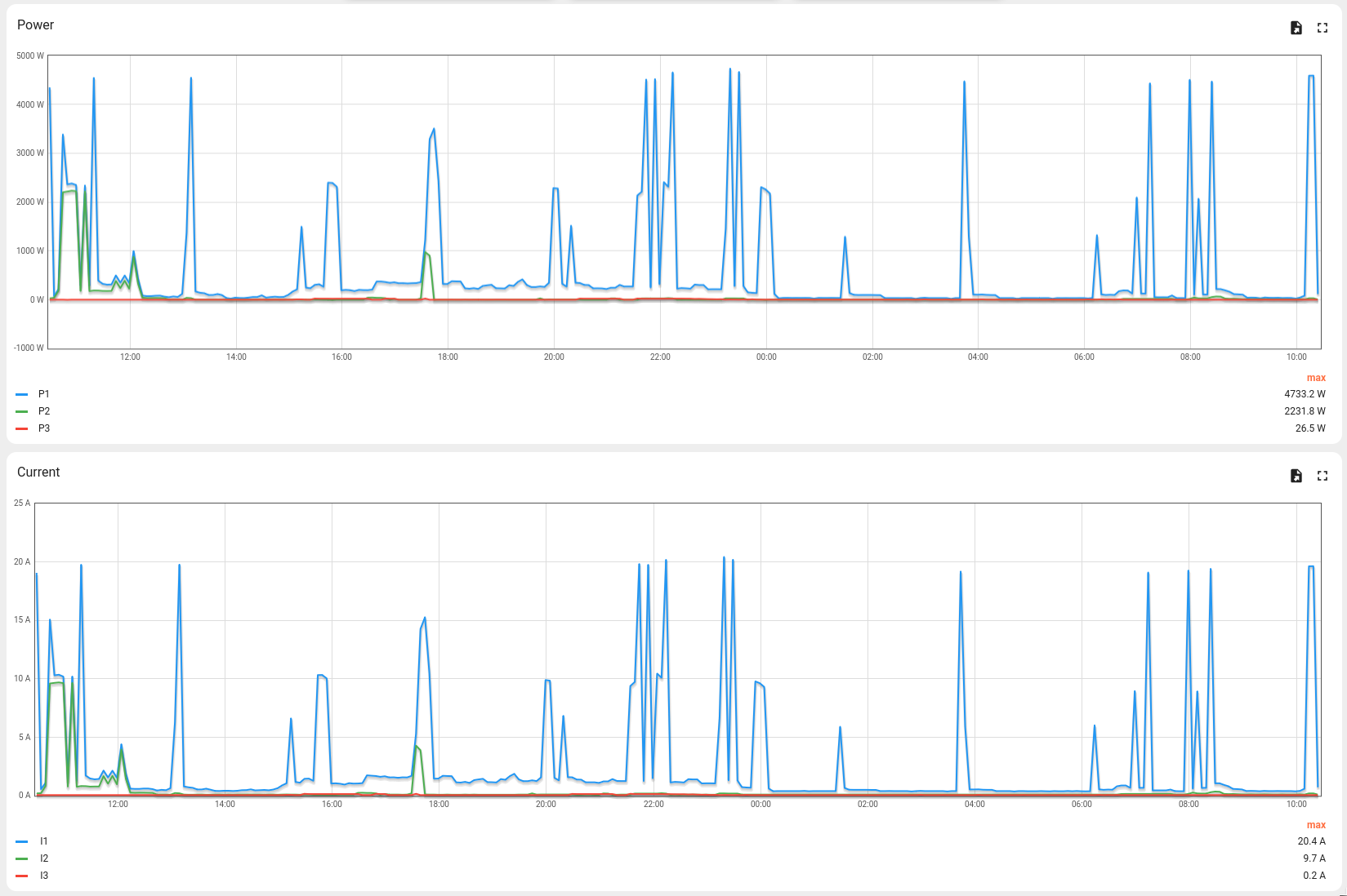
The current values are averages from the last minute. This means that if a data packet is transmitted at 13:01, the values are the average for the minute from 13:00 to 13:01. It could therefore be that the current was 100A for 5 seconds, but only 10A for the other 55 seconds. The average value transmitted is 17.5A. Whether this resolution is sufficient or more detail is required depends on various factors. For example, if only the peak values are important, for example to design a fuse, it is sufficient to transmit the extreme values.

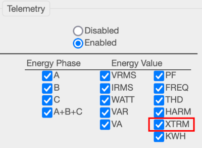
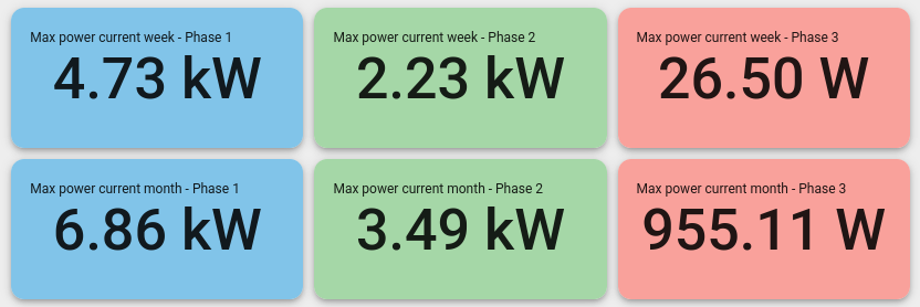
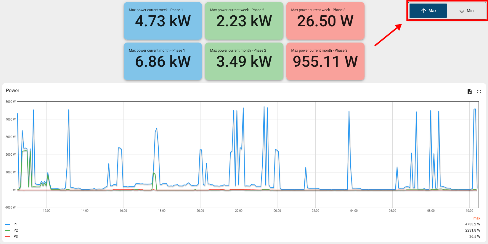
If the transmission of extreme values is enabled, a minimum and maximum value is transmitted every minute. In the case described, the maximum current would be 100A and the minimum 10A.

The extreme values are transmitted for voltage, current and active power. The corresponding telemetry keys contain the suffix "max"/“min” (e.g. "egy_irms_max_a" for the maximum current on phase A).

Display in the dashboard

The dashboards "1. Complete energy values – total" and "2. Complete energy values – 3 phases" use average values. To display the extreme values here, more extensive changes need to be made to the individual graphs, which is why we offer the new ready-made dashboard. This automatically uses the correct telemetry keys (with "max" and "min") to ensure data integrity.

Furthermore, the aggregation (summary) of the data must be taken into account here. The corresponding setting can be found at the top right of the screen under the time setting. Figure 5 shows that data from the last day is displayed in a grouping interval of 5 minutes and with the aggregation "Average". Although the data is available on the server at minute intervals (based on the above-mentioned send interval), it cannot be visualised in this resolution for a large selected time window. Therefore, data points are summarised. In the example mentioned, the average of the five available values is calculated at 5-minute intervals and displayed.

To display maximum and minimum values, select the "Max" or "Min" aggregation here. In this case, the largest/smallest value of the 5-minute interval is displayed. To prevent operating errors, the aggregation in the new extreme values dashboard is automatically changed and cannot be modified by the user.

Figure 5: Data aggregation
Feedback

Do you have any questions or further suggestions? Or perhaps you are interested in customised dashboards for your specific application? Please let us know by sending an email to support@emonio.de.